Scanners, And What They Have To Do With Your Barcode
Barcoding your products can be pretty confusing, especially if the scanner isn't reading them. However, the problem isn't always with the scanner. Sometimes the scanner can't read the barcode because of what it looks like, instead of the scanner being broken.
This is because the human eye is better than the best barcode scanner - what looks like a good barcode to us might be barely perceptible for a scanner. For a barcode to be seen by a scanner, there must be a high contrast between the bars and the spaces. Barcode scanners use a red light source, sometimes even infra red, which is invisible to the human eye. As a result of most scanners operating with these lasers, which identify “red” as white, it is important that appropriate bar and space colors are determined.
The best contrast between barcode and background is made when the background reflects all the light and the bars reflect none. Although this can never really happen, there still needs to be a big difference between the bars and background if the scanner is to read the code. Typically, barcodes are printed in black ink on a white background, which is the best possible contrast. If the barcode is likely to be scanned with an infra red scanner, then the black ink must be carefully chosen. Some black inks are transparent to infra red, like those that are based on vegetable dyes, but black ink based on carbon is more likely to be seen by a scanner. Warm colors such as yellow, red, orange, and white are not seen by the scanner and are good for background colors. Cold colors such as green, blue, violet, and black make a good choice for bars, because they look black under red light.
You may want to use colored barcodes instead of black and white ones. Unfortunately, some color combinations won't work for the barcode scanners, simply because the contrast isn't high enough.
To help you determine the appropriate colors to use for your new barcode, we've put up this little guide of dos and don'ts, so that all the scanners that your product comes in contact with can read them, too!
Barcode Dos
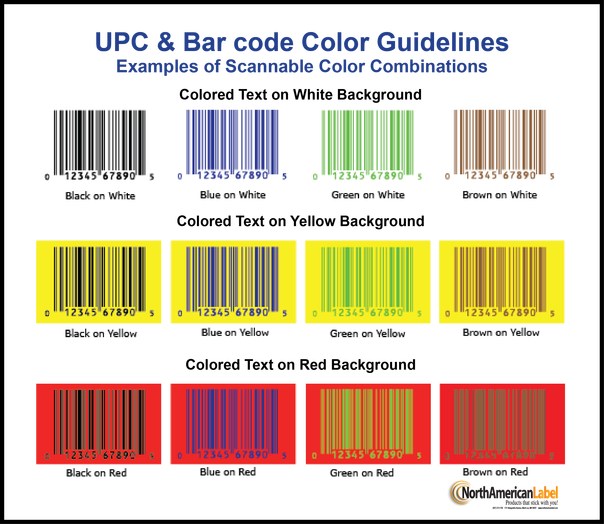
In the image above, you can see a pattern. All the warm colors (in this case, the reds and yellows) make good background colors, but the cool colors (such as the blue and the green) are good for the dark bars in the bar codes.
Barcode Don'ts
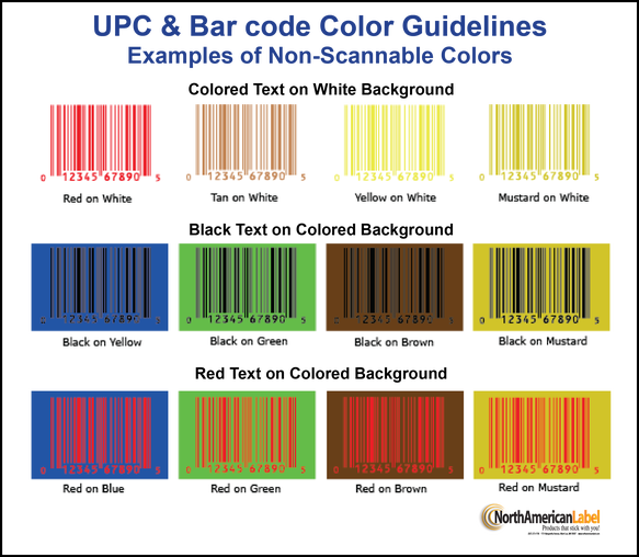
This image shows colors that are comparably too dark or too light for the scanner to be able to tell the difference between the two, leaving each combination entirely unscannable due to the lack of contrast.
Courtesy of